Mapping with Geopandas
Data for this tutorial can be found in the courses repository Folder
One of the nice features of geopandas is its built-in mapping functionality. This makes it really simple to visualize your data as you manipulate it in the database. It is built ontop of matplotlib, so you can quickly add more functionality to your maps beyond some of the defaults.
There are three datafiles associated with this chapter: ne_10m_admin_1_states_provinces_aus, ne_10m_populated_places_simple_aus, and ne_10m_railroads_aus. One each for the three geometric primitives: points, polylines, and polygons. This way you can see how each behaves while being mapped. The data comes from Natural Earth, and has been selected for all of Australia. Also, and this is important, they all have the same spatial reference system: http://spatialreference.org/ref/epsg/gda94-geoscience-australia-lambert/ Australian Geoscience Lambert projection. This is important so the maps will line up properly. You could change the projection using Geopandas, but I’d rather focus primarily on visualizing in this chapter.
We first need to import the proper libraries. Working inside Jupyter Notebook, I will also set matplotlib to inline.
import geopandas as gpd
%matplotlib inline
Now we can read the files. I have the Jupyter Notebook in a parent folder to the data folder, so my paths may be different from where you keep your files. I’ll use a descriptive variable name for each of the new padas dataframes. Let’s also print out one of the layers so we can see the structure of the data. Using list() around the pandas dataframe returns a list of the column names.
admin = gpd.read_file("Data/ne_10m_admin_1_states_provinces_aus.shp")
populated = gpd.read_file("Data/ne_10m_populated_places_simple_aus.shp")
railroads = gpd.read_file("Data/ne_10m_railroads_aus.shp")
print(list(admin))
[u'OBJECTID_1', u'abbrev', u'adm0_a3', u'adm0_label', u'adm0_sr', u'adm1_cod_1', u'adm1_code', u'admin', u'area_sqkm', u'check_me', u'code_hasc', u'code_local', u'datarank', u'diss_me', u'featurecla', u'fips', u'fips_alt', u'gadm_level', 'geometry', u'geonunit', u'gn_a1_code', u'gn_id', u'gn_level', u'gn_name', u'gn_region', u'gns_adm1', u'gns_id', u'gns_lang', u'gns_level', u'gns_name', u'gns_region', u'gu_a3', u'hasc_maybe', u'iso_3166_2', u'iso_a2', u'labelrank', u'latitude', u'longitude', u'mapcolor13', u'mapcolor9', u'name', u'name_alt', u'name_len', u'name_local', u'note', u'postal', u'provnum_ne', u'region', u'region_cod', u'region_sub', u'sameascity', u'scalerank', u'sov_a3', u'sub_code', u'type', u'type_en', u'wikipedia', u'woe_id', u'woe_label', u'woe_name']
As you can see there is the standard geometry column name that is added from the data after it was read from the shapefile. Geopandas dataframes include a plot function that will automatically create a matplotlib figure.
We can also print out the coordinate reference system, map projection, for each dataframe to confirm they are the same.
print(admin.crs)
print(populated.crs)
print(railroads.crs)
{u'lon_0': 134, u'ellps': u'GRS80', u'y_0': 0, u'no_defs': True, u'proj': u'lcc', u'x_0': 0, u'units': u'm', u'lat_2': -36, u'lat_1': -18, u'lat_0': 0}
{u'lon_0': 134, u'ellps': u'GRS80', u'y_0': 0, u'no_defs': True, u'proj': u'lcc', u'x_0': 0, u'units': u'm', u'lat_2': -36, u'lat_1': -18, u'lat_0': 0}
{u'lon_0': 134, u'ellps': u'GRS80', u'y_0': 0, u'no_defs': True, u'proj': u'lcc', u'x_0': 0, u'units': u'm', u'lat_2': -36, u'lat_1': -18, u'lat_0': 0}
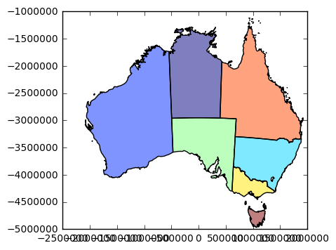
admin.plot()
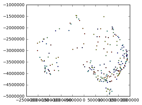
populated.plot()
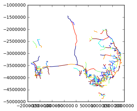
railroads.plot()
<matplotlib.axes._subplots.AxesSubplot at 0x1a8fce10>
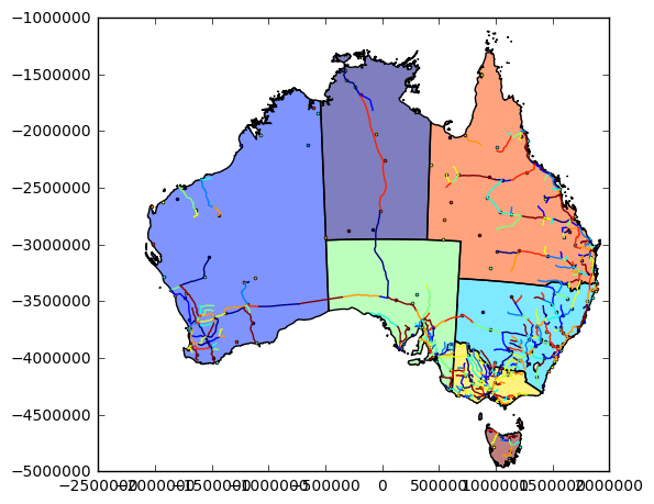
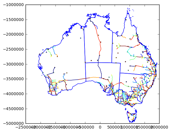
That’s nice if we want to see each layer individually, but that’s not really a map is it? We want to explore the relationship between the features. We need to seem them all overlaid. To do that, we need to establish a figure first, and an axes object, then pass that to the plot function. Some of matplotlib was covered in a previous chapter, and will not be covered here. If you jumped to this section this may be a little confusing.
Begin by importing matplotlib:
import matplotlib.pyplot as plt
Then creating a new subplot which returns figure and axes objects. I’ve set the figure size to 6x6 inches. Then set the aspect ratio to equal, which works best for mapping. This means we will scale both the x and y axes equally. Now when we call the plot function on each of the dataframes, we pass the ax argument with the axes from our subplot. This means that each dataframe will be plotted in the same figure.
fig, ax = plt.subplots(figsize=(6,6))
ax.set_aspect('equal')
admin.plot(ax=ax)
populated.plot(ax=ax)
railroads.plot(ax=ax)
<matplotlib.axes._subplots.AxesSubplot at 0x1c055a58>
Right now, it is producing a categorical plot. That is, each feature in each data frame gets a unique color. We can change this by setting some of the style settings for a matplotlib plot. For example, we can set the line color and the fill color for the polygons.
fig, ax = plt.subplots(figsize=(6,6))
ax.set_aspect('equal')
admin.plot(ax=ax,color='white',edgecolor='blue')
populated.plot(ax=ax)
railroads.plot(ax=ax)
<matplotlib.axes._subplots.AxesSubplot at 0x20b71898>
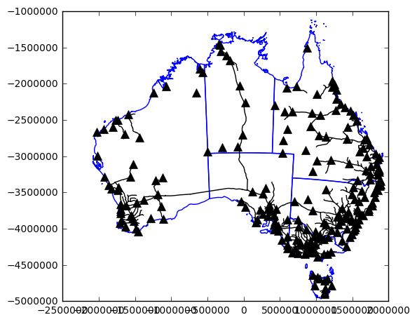
Now we can modify the marker or points in terms of shape, color, and size. The 'k' is shorthand for black. Many of the standard colors can be set using only a single letter. This saves some time typing, but decreases the legibility of your code (unless you are familiar with matplotlib).
fig, ax = plt.subplots(figsize=(6,6))
ax.set_aspect('equal')
admin.plot(ax=ax,color='white',edgecolor='blue')
populated.plot(ax=ax,color='k',marker='^',markersize=8)
railroads.plot(ax=ax, color='k')
<matplotlib.axes._subplots.AxesSubplot at 0x25d0dd30>
Contending with Legends
What is a map if not for a legend? We can add those as well, but it gets tricky. In standard matplotlib plt.plot() we could pass a string to the label argument. This would add a legend item in the legend when we call plt.legend() However, when we try that on say admin.plot(...label='States and Territories') practically every line from that dataframe has its own individual legend item. I won’t show the result, since the figure is too large, but here is the code example.
fig, ax = plt.subplots(figsize=(6,6))
ax.set_aspect('equal')
admin.plot(ax=ax,color='white',edgecolor='blue',label='States and Territories')
populated.plot(ax=ax,color='k',marker='^',markersize=8)
railroads.plot(ax=ax, color='k')
plt.legend()
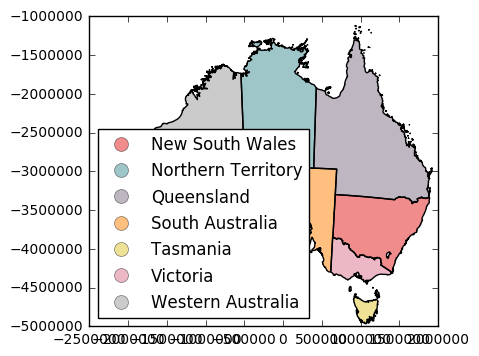
This is different than when we specify a column argument in the geodataframe plot function. In this case the legend will reflect the categorical variable (or quantitative if creating a choropleth map). For example:
admin.plot(column="name",legend=True)
<matplotlib.axes._subplots.AxesSubplot at 0x3179fc88>
We would want to use the ax option to get a hold of the legend object so we could place it better. But legends include non-categorical options as well, such as just the point symbol. What to do then? We can use matplotlib’s legend handler’s to create a mock legend item. This requires using patches, and lines to create a template of what our visualization looks like. First we will import some new objects, and give them a shorter name.
import matplotlib.patches as mpatches
import matplotlib.lines as mlines
Now we can use mpatches.Patch to create a patch that resembles our state and territory borders. Then use mlines.Line2D to create lines and markers to resemble the railroads and populated places. Finally, we will use the legend function’s handles argument to add them our patches and lines to the legend. These don’t get displayed on the actual plot, just are added as legend items. You’re faking matplotlib into thinking they are plotted, in a way.
fig, ax = plt.subplots(figsize=(6,6))
ax.set_aspect('equal')
admin.plot(ax=ax,facecolor='white',edgecolor='blue')
populated.plot(ax=ax,color='k',marker='^',markersize=8)
railroads.plot(ax=ax, color='k')
admin_patch = mpatches.Patch(facecolor='white', edgecolor='blue', label='States and Territories')
populated_line = mlines.Line2D([],[], color='k', marker='^', linestyle='', markersize=8, label="Populated Places")
railroads_line = mlines.Line2D([], [], color='k', marker='', linestyle='-',label="Railroads")
plt.legend(handles=[admin_patch,populated_line,railroads_line])
<matplotlib.legend.Legend at 0x3580c898>
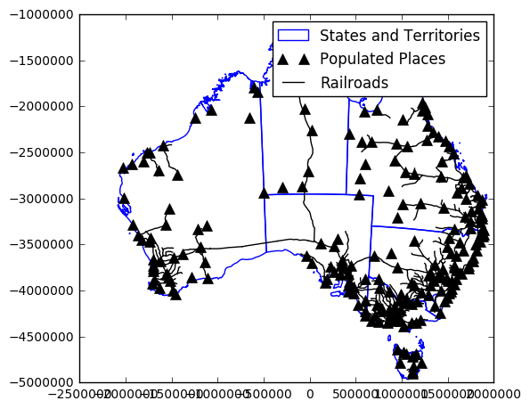
Some explanation of the these functions would be helpful. The Patch function does not require much. It basically mimics what the admin.plot() function contains, and adds a label argument. The Line2D object requires the first two arguments be xdata and ydata. Since we just need place holders for the legend we provide two empty lists. The rest is mimicing what is produced in the previous lines of code. Check out the chapter about matplotlib for more advanced legend placement using transformations.
Using Subplots
#todo
Better Looking Maps
A few problems with the maps presented above are the fontface, and the grid (graticule if it were latitude and longitude). If you are more familiar with ArcMap, when you create a map, you have a lot of options in terms of styling your map. You also can do a lot with matplotlib, but it requires getting here hands dirty in the code. Let’s clean up the map a little bit by setting some default values at the matplotlib level. We will import the whole library as mpl to begin.
import matplotlib as mpl
Now we can change the default font family and size used for the map. This will help create a consistent style in your map text, but also is easier than changing individually for each piece of text. This won’t work if you want different font styles, but a map will typically only use one, or two. I’ll use Times New Roman, since it should be available on most computers.
mpl.rc('font',family='Times New Roman')
mpl.rcParams.update({'font.size': 9})
Here we have set the default font family to Times New Roman, and a default size to 9. Replotting with these settings produces this map:
fig, ax = plt.subplots(figsize=(6,6))
ax.set_aspect('equal')
admin.plot(ax=ax,facecolor='white',edgecolor='blue')
populated.plot(ax=ax,color='k',marker='^',markersize=8)
railroads.plot(ax=ax, color='k')
admin_patch = mpatches.Patch(facecolor='white', edgecolor='blue', label='States and Territories')
populated_line = mlines.Line2D([],[], color='k', marker='^', linestyle='', markersize=8, label="Populated Places")
railroads_line = mlines.Line2D([], [], color='k', marker='', linestyle='-',label="Railroads")
plt.legend(handles=[admin_patch,populated_line,railroads_line])
<matplotlib.legend.Legend at 0x339a0668>
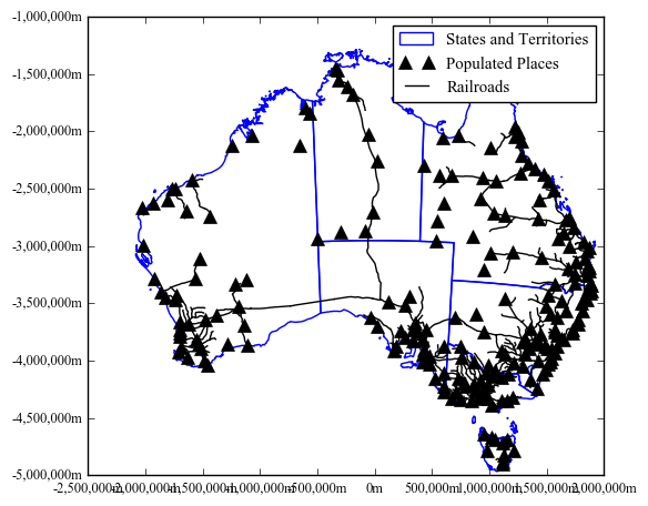
That certainly reduced the overlapping tick labels. Still, they aren’t formatted very nicely. In matplotlib you have control over how these labels look. This can be setup using a custom function that processes the label and returns a string. It requires importing the ticker object.
from matplotlib import ticker
First we will define the function using standard python notation. I’ll call it meters_formatter, but you can call it whatever. It will accept to arguments x (the string to be formatted) and p (the position of the ticker).
The function processes the number so that it is formatted with commas at appropriate intervals, and appends an m afterwards. It then returns the result.
def meters_formatter(x, p):
    strRes = '{:,}m'.format(int(x))
    return strRes```
Then we need to get access to the formatter for the major ticks. This is the ticks on the axes that contains a label. We do this twice, once for each axis. It can use the same function. We pass the name of the function we created into the ```ticker.FuncFormatter``` method.
```python
ax.xaxis().set_major_formatter(ticker.FuncFormatter(meters_formatter))
ax.yaxis().set_major_formatter(ticker.FuncFormatter(meters_formatter))```

It's all a bit confusing, I realize, but this is a flexible way to modify the tick labels like 500000 so they look more like 500,000m. And you don't need to do this manually for each piece of label, but all at once using the generic function. Let's see the results here.


```python
def meters_formatter(x, p):
    strRes = '{:,}m'.format(int(x))
    return strRes

fig, ax = plt.subplots(figsize=(6,6))
ax.set_aspect('equal')
admin.plot(ax=ax,facecolor='white',edgecolor='blue')
populated.plot(ax=ax,color='k',marker='^',markersize=8)
railroads.plot(ax=ax, color='k')

ax.xaxis.set_major_formatter(ticker.FuncFormatter(meters_formatter))
ax.yaxis.set_major_formatter(ticker.FuncFormatter(meters_formatter))

admin_patch = mpatches.Patch(facecolor='white', edgecolor='blue', label='States and Territories')
populated_line = mlines.Line2D([],[], color='k', marker='^', linestyle='', markersize=8, label="Populated Places")
railroads_line = mlines.Line2D([], [], color='k', marker='', linestyle='-',label="Railroads")
plt.legend(handles=[admin_patch,populated_line,railroads_line])
<matplotlib.legend.Legend at 0x3de0b0f0>
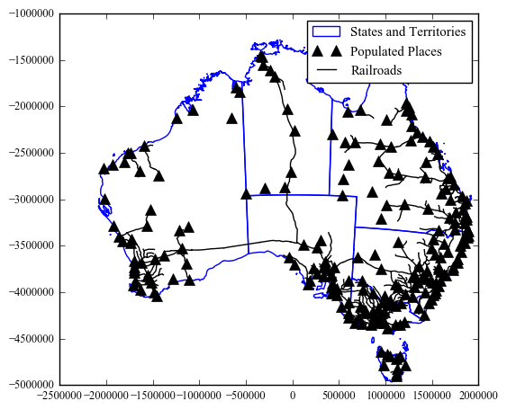
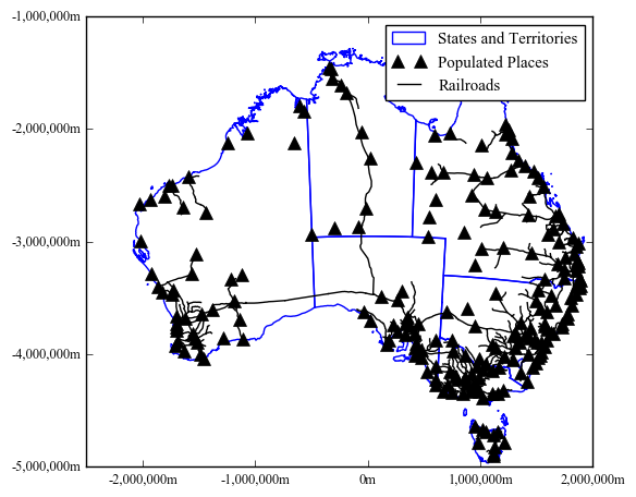
Now we are back to the problem of overlapping labels along the axes. We can fix this by specifying the interval between major and minor ticks. Or just major ticks in this case. We could do this manually, given we can see the bounds of the plot window and provide a list of numbers. Even better is to let matplotlib figure it out for us using ticker.MultipleLocator According to the documentation this fucntion performs this task: Set a tick on every integer that is multiple of base in the view interval. In other words, it finds the interval based on the value you pass. We set the intervals for the major ticks using the axis.set_major_locator(). In the above figure we can see that the interval is already at 500,000, so we need to go bigger Setting it to one million works well.
def meters_formatter(x, p):
    strRes = '{:,}m'.format(int(x))
    return strRes

fig, ax = plt.subplots(figsize=(6,6))
ax.set_aspect('equal')
admin.plot(ax=ax,facecolor='white',edgecolor='blue')
populated.plot(ax=ax,color='k',marker='^',markersize=8)
railroads.plot(ax=ax, color='k')

ax.xaxis.set_major_formatter(ticker.FuncFormatter(meters_formatter))
ax.yaxis.set_major_formatter(ticker.FuncFormatter(meters_formatter))

ax.xaxis.set_major_locator(ticker.MultipleLocator(1000000))
ax.yaxis.set_major_locator(ticker.MultipleLocator(1000000))

admin_patch = mpatches.Patch(facecolor='white', edgecolor='blue', label='States and Territories')
populated_line = mlines.Line2D([],[], color='k', marker='^', linestyle='', markersize=8, label="Populated Places")
railroads_line = mlines.Line2D([], [], color='k', marker='', linestyle='-',label="Railroads")
plt.legend(handles=[admin_patch,populated_line,railroads_line])
<matplotlib.legend.Legend at 0x47fee358>
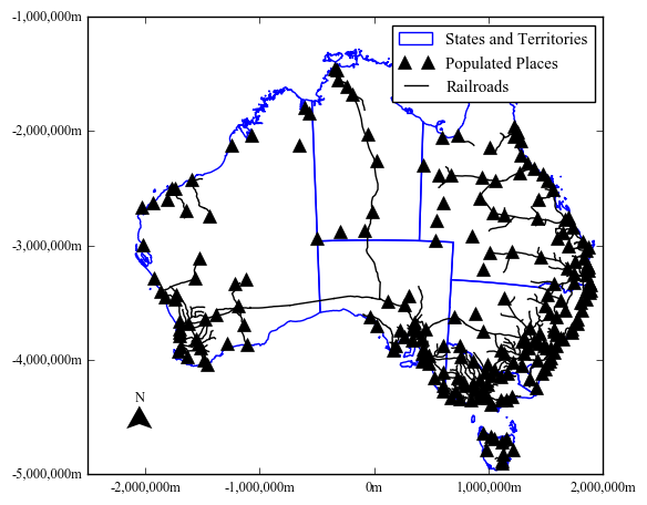
North Arrow and Scale Bar
One of the advantages of using a grid, is it provides you with scale and direction of your map. At least, if you are familiar with the coordinate system. It certainly provides the scale of your map
from matplotlib.path import Path
def northArrowPatch(x,y,width,height,ax,trans):
    """x - lower left corner of arrow in trans coordinates
       y - lower left corner of arrow in trans coordiantes
       width - estimated width of arrow in trans coordiantes
       height - estimated height of arrow in trans coordiantes
       ax - axes to add patch and text
       trans - transformation the coordinates are in"""
    verts = []
    codes = []
    for part in range(0,4):
        if part == 0:
            verts.append((x,y))
            codes.append(Path.MOVETO)
        if part == 1:
            verts.append((x+(width/2.0),y-(height)))
            codes.append(Path.LINETO)
        if part == 2:
            verts.append((x,y-(height-(1.0/5.0)*height)))
            codes.append(Path.LINETO)
        if part == 3:
            verts.append((x-(width/2.0),y-(height)))
            codes.append(Path.LINETO)
            verts.append((x,y))
            codes.append(Path.CLOSEPOLY)

    path = Path(verts, codes)
    northPatch = mpatches.PathPatch(path, facecolor='k', lw=0,transform=trans)
    ax.add_patch(northPatch)
    lbl = ax.text(x,y+((1.0/5.0)*height),'N',transform=trans,ha='center')
    return northPatch,lbl

def meters_formatter(x, p):
    strRes = '{:,}m'.format(int(x))
    return strRes

fig, ax = plt.subplots(figsize=(6,6))
ax.set_aspect('equal')
admin.plot(ax=ax,facecolor='white',edgecolor='blue')
populated.plot(ax=ax,color='k',marker='^',markersize=8)
railroads.plot(ax=ax, color='k')

ax.xaxis.set_major_formatter(ticker.FuncFormatter(meters_formatter))
ax.yaxis.set_major_formatter(ticker.FuncFormatter(meters_formatter))

ax.xaxis.set_major_locator(ticker.MultipleLocator(1000000))
ax.yaxis.set_major_locator(ticker.MultipleLocator(1000000))

nrth,lbl = northArrowPatch(.1,.15,.05,.05,ax,ax.transAxes)
admin_patch = mpatches.Patch(facecolor='white', edgecolor='blue', label='States and Territories')
populated_line = mlines.Line2D([],[], color='k', marker='^', linestyle='', markersize=8, label="Populated Places")
railroads_line = mlines.Line2D([], [], color='k', marker='', linestyle='-',label="Railroads")
plt.legend(handles=[admin_patch,populated_line,railroads_line])
<matplotlib.legend.Legend at 0x4c38add8>
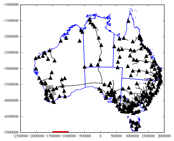
def scaleBar(x,y,mapdistance,ax,trans,subdivisions=1,height=.01):
    """x - lower left corner of arrow in trans coordinates
       y - lower left corner of arrow in trans coordiantes
       mapdistance - maximum distance to show on the scalebar
       ax - axes to add patch and text
       trans - transformation the coordinates are in
       subdivision - number of subdivisions to show in the scalebar
       height - height of the bar part of the scalebar"""
    #ymin, ymax = ax.get_ylim() #returns bottom,top
    xmin, xmax = ax.get_xlim() #returns left,right
    abs_width = abs(xmax-xmin)
    length = 1.0/abs_width * mapdistance
    ax.add_patch(mpatches.Rectangle((x,y),length, height, transform=trans,lw=0,facecolor='red'))
fig, ax = plt.subplots(figsize=(6,6))
ax.set_aspect('equal')
admin.plot(ax=ax,facecolor='white',edgecolor='blue')
populated.plot(ax=ax,color='k',marker='^',markersize=8)
railroads.plot(ax=ax, color='k')

scaleBar(0.22222222222222221,.0,500000,ax,ax.transAxes)
#print ax.transAxes.inverted().transform(ax.transData.transform([-1500000,-5000000])) #use these functions if you want to see where a data coordinate lies on the axes
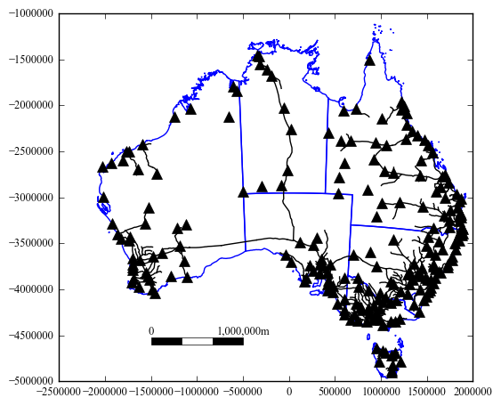
def scaleBar(x,y,mapdistance,ax,trans,subdivision=1,height=.02):
    """x - lower left corner of arrow in trans coordinates
       y - lower left corner of arrow in trans coordiantes
       mapdistance - maximum distance to show on the scalebar
       ax - axes to add patch and text
       trans - transformation the coordinates are in
       subdivision - number of subdivisions to show in the scalebar
       height - height of the bar part of the scalebar"""
    xmin, xmax = ax.get_xlim() #returns left,right
    abs_width = abs(xmax-xmin)
    length = 1.0/abs_width * mapdistance
    if subdivision > 1.0:
        sublength = float(length)/subdivision
        fColor = 'black'
        subx = x
        for i in range(0,subdivision):

            ax.add_patch(mpatches.Rectangle((subx,y), sublength, height, transform=trans,facecolor=fColor,edgecolor='black',lw=.5))
            subx += sublength
            if fColor == 'black':
                fColor = 'white'
            else:
                fColor = 'black'

    else:
        ax.add_patch(mpatches.Rectangle((x,y), length, height, transform=trans,facecolor='black',edgecolor='black'))

    ax.text(x,y+height*1.5,'0',transform=trans,ha='center')
    ax.text(x+length,y+height*1.5,meters_formatter(mapdistance,None),transform=trans,ha='center')
fig, ax = plt.subplots(figsize=(6,6))
ax.set_aspect('equal')
admin.plot(ax=ax,facecolor='white',edgecolor='blue')
populated.plot(ax=ax,color='k',marker='^',markersize=8)
railroads.plot(ax=ax, color='k')

scaleBar(0.22222222222222221,.1,1000000,ax,ax.transAxes,subdivision=3)
0.222222222222
0.296296296296
0.37037037037
from matplotlib.path import Path
import matplotlib as mpl
from matplotlib import ticker
import matplotlib.pyplot as plt
import geopandas as gpd
import matplotlib.patches as mpatches
import matplotlib.lines as mlines
%matplotlib inline

admin = gpd.read_file("Data/ne_10m_admin_1_states_provinces_aus.shp")
populated = gpd.read_file("Data/ne_10m_populated_places_simple_aus.shp")
railroads = gpd.read_file("Data/ne_10m_railroads_aus.shp")

def meters_formatter(x, p):
    strRes = '{:,}m'.format(int(x))
    return strRes

def scaleBar(x,y,mapdistance,ax,trans,subdivision=1,height=.02):
    """x - lower left corner of arrow in trans coordinates
       y - lower left corner of arrow in trans coordiantes
       mapdistance - maximum distance to show on the scalebar
       ax - axes to add patch and text
       trans - transformation the coordinates are in
       subdivision - number of subdivisions to show in the scalebar
       height - height of the bar part of the scalebar"""
    xmin, xmax = ax.get_xlim() #returns left,right
    abs_width = abs(xmax-xmin)
    length = 1.0/abs_width * mapdistance
    if subdivision > 1.0:
        sublength = float(length)/subdivision
        fColor = 'black'
        subx = x
        for i in range(0,subdivision):
            ax.add_patch(mpatches.Rectangle((subx,y), sublength, height, transform=trans,facecolor=fColor,edgecolor='black',lw=.5,clip_on=False))
            subx += sublength
            if fColor == 'black':
                fColor = 'white'
            else:
                fColor = 'black'

    else:
        ax.add_patch(mpatches.Rectangle((x,y), length, height, transform=trans,facecolor='black',edgecolor='black',clip_on=False))

    ax.text(x,y+height*1.5,'0',transform=trans,ha='center')
    ax.text(x+length,y+height*1.5,meters_formatter(mapdistance,None),transform=trans,ha='center')

def northArrowPatch(x,y,width,height,ax,trans):
    """x - lower left corner of arrow in trans coordinates
       y - lower left corner of arrow in trans coordiantes
       width - estimated width of arrow in trans coordiantes
       height - estimated height of arrow in trans coordiantes
       ax - axes to add patch and text
       trans - transformation the coordinates are in"""
    verts = []
    codes = []
    for part in range(0,4):
        if part == 0:
            verts.append((x,y))
            codes.append(Path.MOVETO)
        if part == 1:
            verts.append((x+(width/2.0),y-(height)))
            codes.append(Path.LINETO)
        if part == 2:
            verts.append((x,y-(height-(1.0/5.0)*height)))
            codes.append(Path.LINETO)
        if part == 3:
            verts.append((x-(width/2.0),y-(height)))
            codes.append(Path.LINETO)
            verts.append((x,y))
            codes.append(Path.CLOSEPOLY)

    path = Path(verts, codes)
    northPatch = mpatches.PathPatch(path, facecolor='k', lw=0,transform=trans,clip_on=False)
    ax.add_patch(northPatch)
    lbl = ax.text(x,y+((1.0/5.0)*height),'N',transform=trans,ha='center')
    return northPatch,lbl

mpl.rc('font',family='Times New Roman')
mpl.rcParams.update({'font.size': 9})

fig, ax = plt.subplots(figsize=(5,5))
ax.set_aspect('equal')

ax.get_xaxis().set_visible(False)
ax.get_yaxis().set_visible(False)

admin.plot(ax=ax,facecolor='white',edgecolor='blue')
populated.plot(ax=ax,color='k',marker='^',markersize=8)
railroads.plot(ax=ax, color='k')

ax.xaxis.set_major_formatter(ticker.FuncFormatter(meters_formatter))
ax.yaxis.set_major_formatter(ticker.FuncFormatter(meters_formatter))

ax.xaxis.set_major_locator(ticker.MultipleLocator(1000000))
ax.yaxis.set_major_locator(ticker.MultipleLocator(1000000))

#ucomment these lines to create a box around the north arrow and scalebar in the lower left hand corner of the map.
#ax.add_patch(mpatches.Rectangle((.02,.02), .4, .15, transform=ax.transAxes,facecolor='white',edgecolor='black'))
#nrth,lbl = northArrowPatch(.06,.1,.05,.05,ax,ax.transAxes)
#scaleBar(.12,.055,1000000,ax,ax.transAxes,subdivision=3)


#for the legend
admin_patch = mpatches.Patch(facecolor='white', edgecolor='blue', label='States and Territories')
populated_line = mlines.Line2D([],[], color='k', marker='^', linestyle='', markersize=8, label="Populated Places")
railroads_line = mlines.Line2D([], [], color='k', marker='', linestyle='-',label="Railroads")

#plt.legend(handles=[admin_patch,populated_line,railroads_line])#uncomment if you want the legend in the upper right

#place these in the legend at the bottom of the map
additionalArtists = []
brd = ax.add_patch(mpatches.Rectangle((1.0,0), .4, 1.0, transform=ax.transAxes,facecolor='white',edgecolor='black',clip_on=False))
additionalArtists.append(brd)
lgd = plt.legend(handles=[admin_patch,populated_line,railroads_line],bbox_to_anchor=(1.01, .95),loc=2,borderaxespad=0.,frameon=False)
additionalArtists.append(lgd)
nrth,lbl = northArrowPatch(1.2,.3,.04,.05,ax,ax.transAxes)

scaleBar(1.1,.15,1000000,ax,ax.transAxes,subdivision=2)
plt.tight_layout()

fig.savefig('mapOutput_fin.png', dpi=300, format='png', bbox_extra_artists=additionalArtists, bbox_inches='tight')
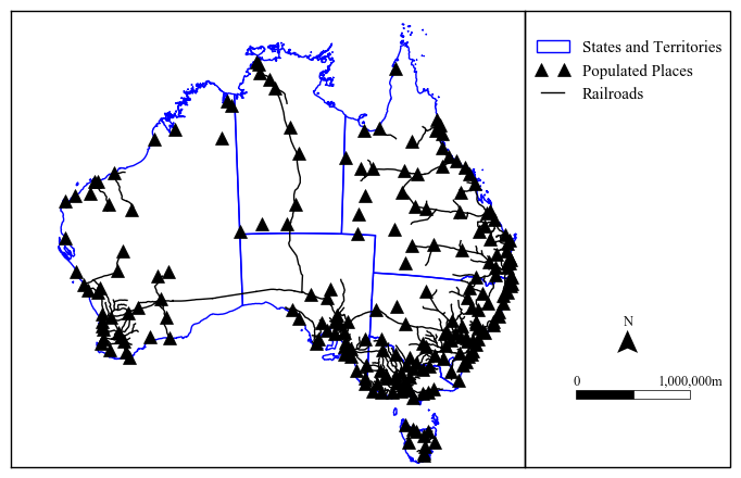
Note the addition of a new property clip_on. Setting this to false allows the patches to be drawn outside the axes areas. This let us create a legend on the side.
Finally we export the map to a png file with a dpi of 300. In order to make sure everything is exported to the file that is outside of our figure boundaries, we need to keep track of the artists we added like the legend object and the rectangle border that was added on the right-hand side. Create a variable to keep the artists as they are added, and append them to a list. This gets placed in the savefig() function.

Hopefully, it is obvious the intent of this chapter was not to give you a “cookbook” of different map styles, but to give you the intuition about how you need to create maps in matplotlib using geopandas as a base. You have nearly complete control over every aspect of your map, and it is up to you on how to use it. You could just use matplotlib as a way to draw the spatial data, then export this out to a graphic design program like Adobe Illustrator or the open source InkScape to have even better (visual) graphic design control.